Bullseye
Designing an in-store product wayfinder for Target using Augmented Reality (2022).


Problem
Post-pandemic, Target was struggling to bring customers back in-store, which was negatively impacting sales. Therefore, Target approached us to figure out where they were going wrong and to propose solutions.
Solution
We conducted research on the state of hybrid (digital + physical) retail amongst competitors and Target, identified that Target’s in-store wayfinding experience could be improved to improve sales, and designed an in-app feature for product wayfinding supported by Augmented Reality.
Details
Year: 2022
Duration: 6 months
Project Team: 2x4, Target (Digital & Product)
My Role
My roles on this project included trend analysis, customer experience research, and experience design.
Competitive Analysis
We started the research process of the hybrid retail landscape by researching trends in the space as well as competitor strategies and experiences, categorizing them by their spatial qualities and degree of interactivity. From this analysis, we confirmed that most hybrid retail experiences were focused on mobile and personalization to the customer.
Persona Building
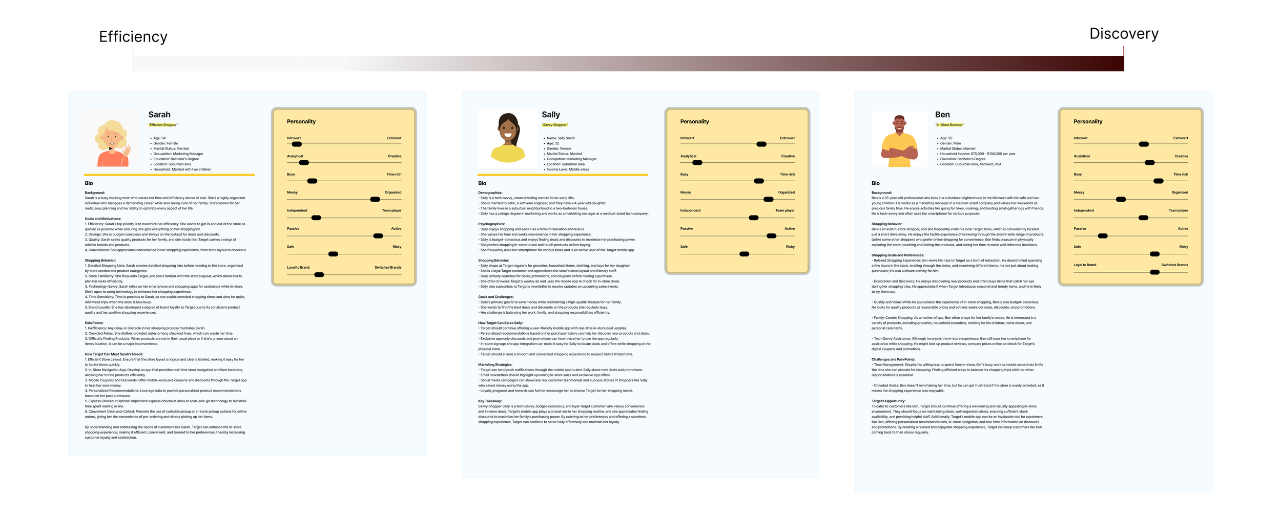
We then used our customer research thus far to create personas of the most common omnichannel customers that Target sees as well as their main reasons for visiting the store. Our research indicated that customers sit on a spectrum that extends from those that want to find the products they’re looking for as quickly as possible and those that browse with no objective. Therefore, I created a set of 3 personas that cover this spectrum, which we then designed around.
Efficient Buyer
Savvy Shopper
In-Store Browser
Journey Mapping
From our customer interviews, client workshops, and ethnographic research, we learned that the three most critical decisions and therefore moments in the customer journey were ‘Decide’, ‘Locate’, and ‘Pay.’ We found that the Locate moment, which is the moment a customer finds a product they were looking for, is 1) critical to establishing brand loyalty among customers, who should always feel that Target is the store for them, and 2) key to retriggering customers to purchase products they weren’t originally looking for.
Technological Evaluation
To harness the Target app to optimize the Locate moment, we had to determine which medium to focus on to bridge Target’s physical product wayfinding experience and in-app user experience. After evaluating the below technologies, we felt that augmented reality was the best technology to include in the Target app due to its relatively low cognitive load, high degree of personalization, ability to imitate and augment the experience of in-store browsing, and seamless integration with already existent in-app features.
Wayfinding Interface Exploration
One of the key criteria for Bullseye was seamless integration with the currently existing Target app, which already includes the ability to create a shopping list and visualize their locations in a 2D map. Though this 2D map presented users with a high cognitive load, I proposed to implement our AR feature with this map, which would be the easiest way to navigate from product pages to our new augmented reality feature. The below user flows demonstrate how Bullseye adds onto and integrates seamlessly with the current Target app rather than hindering and challenging the already existing user experience.
Wayfinding Interface Exploration
Initial prototyping began with an exploration of the basic elements of navigation: markers, or waypoints, a compass, and directional indicators. Ultimately, a compass proved to be most intuitive for users and presented them with the least cognitive load.
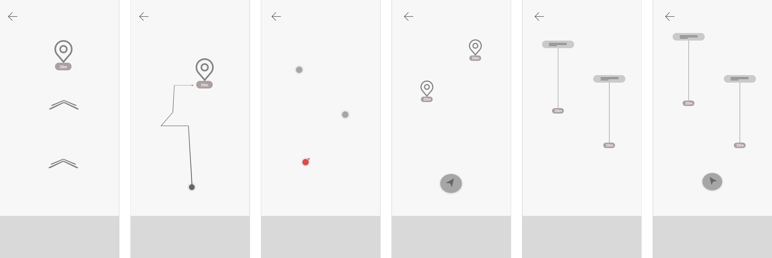
LoFi/MidFi Prototyping #1
After prototyping an experience around elliptical waypoints, I realized that the screen was too cluttered and that the interface was complicated, presenting users with higher cognitive load and hindering their shopping experience rather than augmenting it. Instead, I decided to switch to more minimal waypoints and the use of a pop-up menu, which could not only provide navigational CTA but also product information and promotions as well as link to in-app product pages.

LoFi/MidFi Prototyping #2
In the prototypes below, I chose to expand on the previously identified elliptical waypoint design, including an exploration of a toggle menu that allows users to customize their wayfinding experience as well as an items/shopping list queue. I then created a higher fidelity prototype showcasing how waypoints may link to product pages.
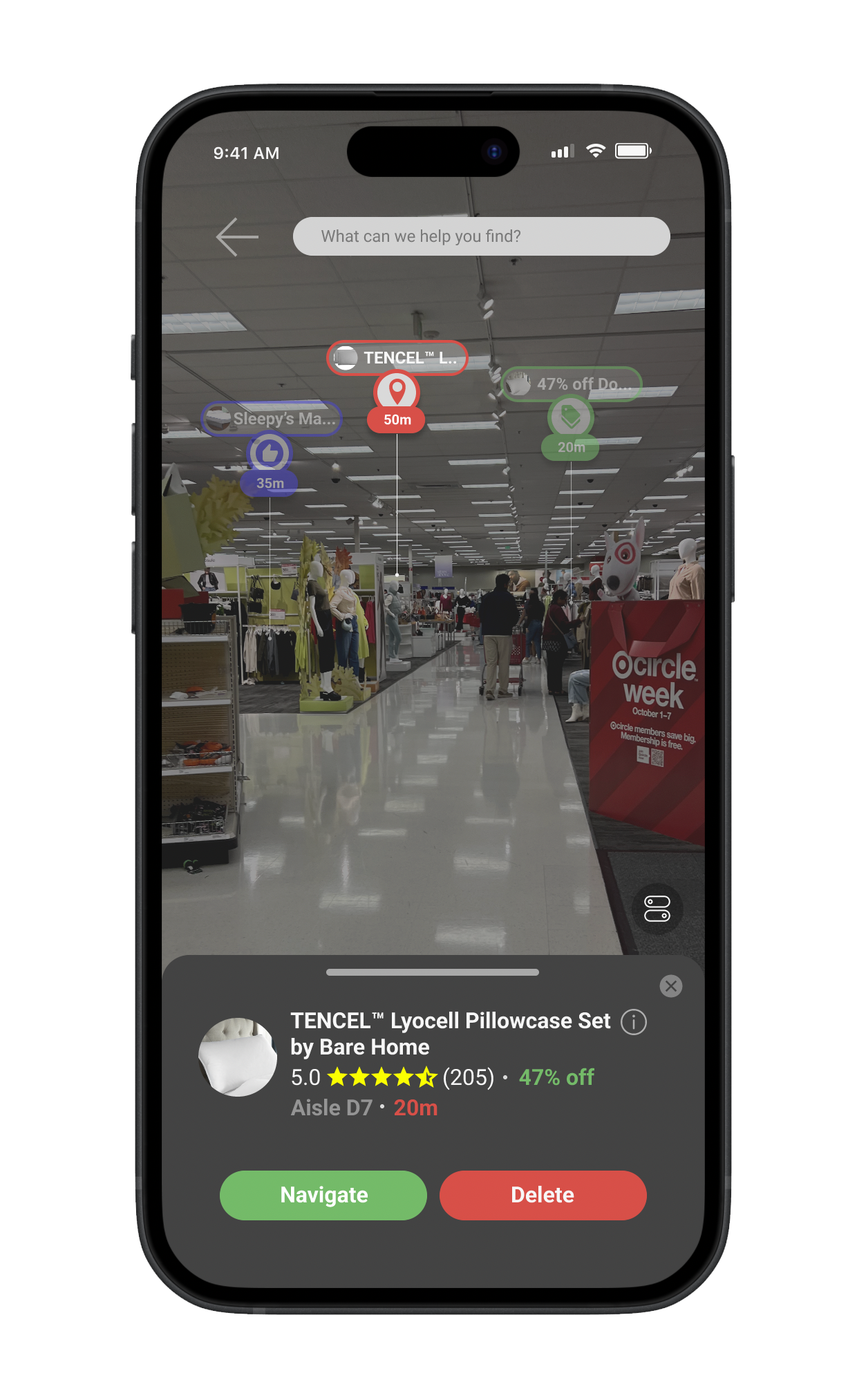
Bullseye
There were three groups of waypoints that I ultimately ended up including.
Item waypoints for users who wanted to find specific items as quickly as possible.
Recommended waypoints that display recommended products based on products in user’s shopping list, user’s shopping history, and user’s in-store location.
Deal waypoints that show ongoing promotions that the user may be interested in.